Client
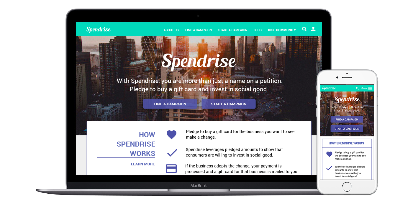
Spendrise is a social good platform for creating positive change in businesses. It allows consumers to participate in what is essentially a reverse boycott: instead of boycotting a business until it changes its policies, consumers pledge to buy a gift card to the business only if it makes the change.
Spendrise wants to redesign the campaign landing page and pledge flow of its website in order to better communicate the process to users and increase pledges.
Duration
2 ½ weeks
Team
Sharon Choi - Project Manager
EJ Hillman - Research Lead
Chris Oliver - Product Manager
EJ Hillman - Research Lead
Chris Oliver - Product Manager
My Role
Product management, competitive analysis, user interviews, persona creation, brand development and style guide creation, visual design, mobile design from sketches to prototypes, desktop design support, usability testing
Tools
Pen, Paper, Marker, Whiteboard, Google Forms, Balsamiq, InVision, Sketch, InDesign, Keynote
Discovery & Research
Stakeholder Interviews
My team and I began the project by conducting interviews with Spendrise Founder and CEO, Eric Shih, as well as one of his consultants. We discussed the project requirements, deliverables, and the aspects of the website that needed the most improvement: communicating the pledge process to the user and updating the visual design to more accurately reflect the company vision.
Evaluation of Current Website
Eric provided us with usability test recordings and user feedback from the current website. I analyzed this data and learned that it not only reaffirmed Eric’s concern about users not understanding the process but also that users were hesitant to pledge because campaigns did not have goals, and as such, users could not tell how campaigns were progressing. I also reviewed the website myself and discovered another big issue: the layout and content varied from one campaign page to the next.
Competitive Analysis
We researched several of Spendrise's direct, traditional, and like-minded competitors. The direct competitors (Threshold and Payola) had narrower scopes and less of a community focus. The traditional competitors (Kickstarter, change.org etc.) are well known and trusted, and we took layout inspiration from them in an effort to inspire trust. The like-minded competitors (Boomcast and AirBnB) confirmed our target audience's desire to directly connect with each other and create social change.
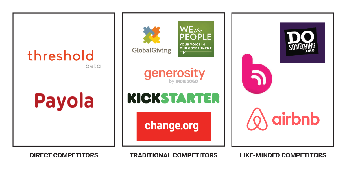
Spendrise competitors we researched
User Research
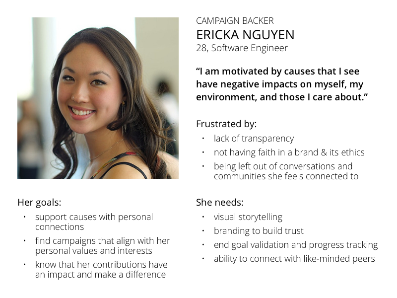
We created a screener survey using Google Forms and received 51 responses. We selected 19 of the respondents that matched our target market, and I interviewed 5 of them about their behaviors using social good and crowdfunding websites. We used the results of these interviews along with extensive secondary research to create two user personas: Ericka, a campaign backer and our primary persona, and Julia, a campaign creator.
Ideation
Mind Map
We began ideation by creating a mind map for Spendrise. This helped us generate ideas for possible features and solutions for the new design.

The team making a mind map for Spendrise
Feature Prioritization
We listed out possible features that had been developed during ideation or observed in competitive analysis. We then prioritized those features based on the goals and needs of our personas to create our MVP (Minimum Viable Product).
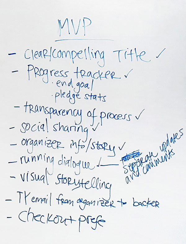
The feature list for our MVP
Rough Sketches
Each member of the team individually sketched out possible screens for the Spendrise interface. Together, we reviewed the sketches and then combined the best aspects of each into one design.
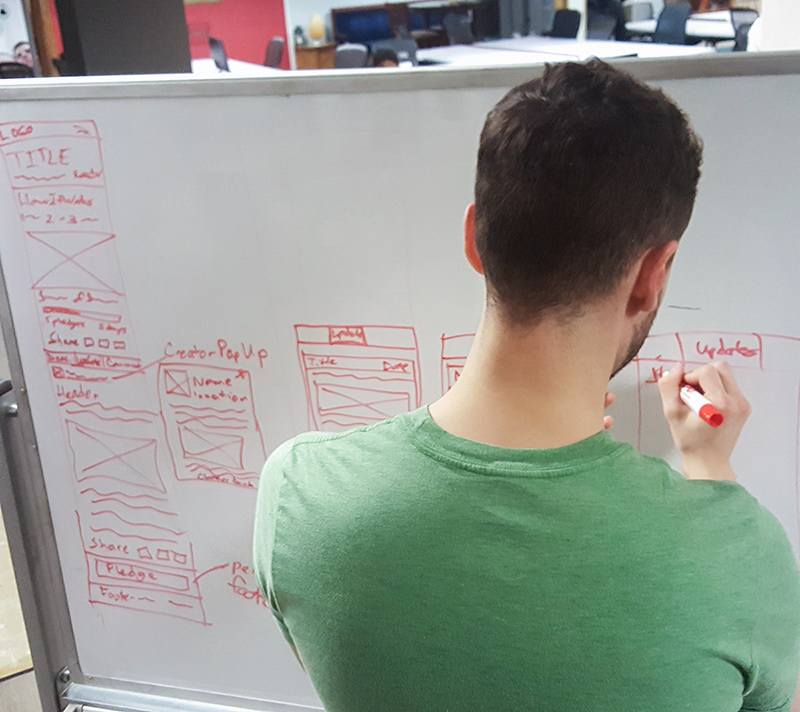
Me sketching the mobile interface during the design studio
Lo-Fi Prototyping and Testing
Wireframes & Lo-Fi Prototypes
With the basic features and layouts settled, I set up shared projects for the team on myBalsamiq, which we used to collaborate on creating wireframes from our sketches. I led the design of the mobile layout while supporting the design of the desktop layout. We then uploaded the completed wireframes to InVision and created low-fidelity interactive prototypes to begin testing.
Usability Testing & Results
We conducted two rounds of usability tests, iterating on our designs after each round. Because theses prototypes were filled with placeholder content, it was difficult to get good feedback from users about how well they understood the process, so most of the changes we made at this stage were minor.
Branding & Visual Design
Branding
During the initial stakeholder interview, Eric expressed that he was not satisfied with the current branding for Spendrise because it was too dark and uninviting. He believed Spendrise should be motivating, positive, bright, inviting, and with more focus on community.
Using this as a starting point, we researched other brands with similar attributes for inspiration. In particular, Under Armour did an excellent job of explaining its brand, so we used it as a model as we defined the new brand attributes for Spendrise.
Color Palette & Typography
Building off of the brand attributes, we developed a new color palette and typography for Spendrise. We then validated the new style by showing it to users, who described it as welcoming, bright, inviting, calming, and positive.

New colors and typography we developed for Spendrise
Style Guide
I compiled all of our work on the new branding into a style guide for the team to use as a reference for this project and also for Spendrise to use with future designs.
Hi-Fi Prototyping and Testing
Hi-Fi Mockups & Prototypes
Using our refined wireframes and the new branding, we created high-fidelity mockups in Sketch. Again, I led the design of the mobile layout and collaborated on the design of the desktop layout. I set up shared projects for the team using InVision Sync to ensure that the designs were staying consistent even when we were working separately. After completing the mockups, we created interactive prototypes with InVision for testing.
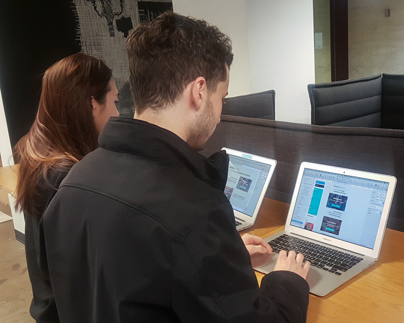
Collaborating on the design of the high-fidelity mockups
Usability Testing & Results
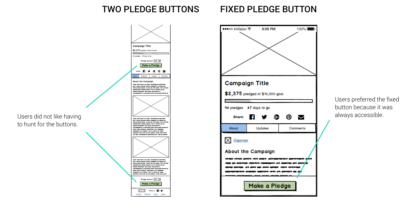
Once again, we conducted two rounds of usability tests, iterating on our designs after each round. One of the biggest changes we made at this point was changing the location of the “How It Works” section. Originally, we placed it at the top of the page in the hopes that this would help to better educate users on the pledging process. However, users were annoyed that this section was getting in the way of the real content they wanted to view, so we moved “How It Works” down the page and moved the content up.
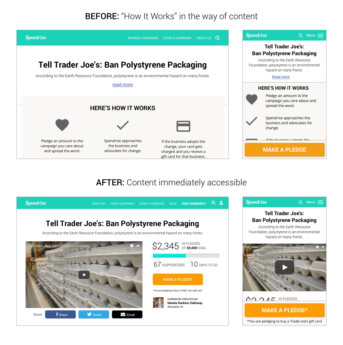
Moving this educational information down the page created a new problem, though: many users did not realize that they were actually pledging to buy a gift card until they were nearly done pledging. To remedy this, we added explanations and reminders about the process throughout the layout before, during, and after pledging.
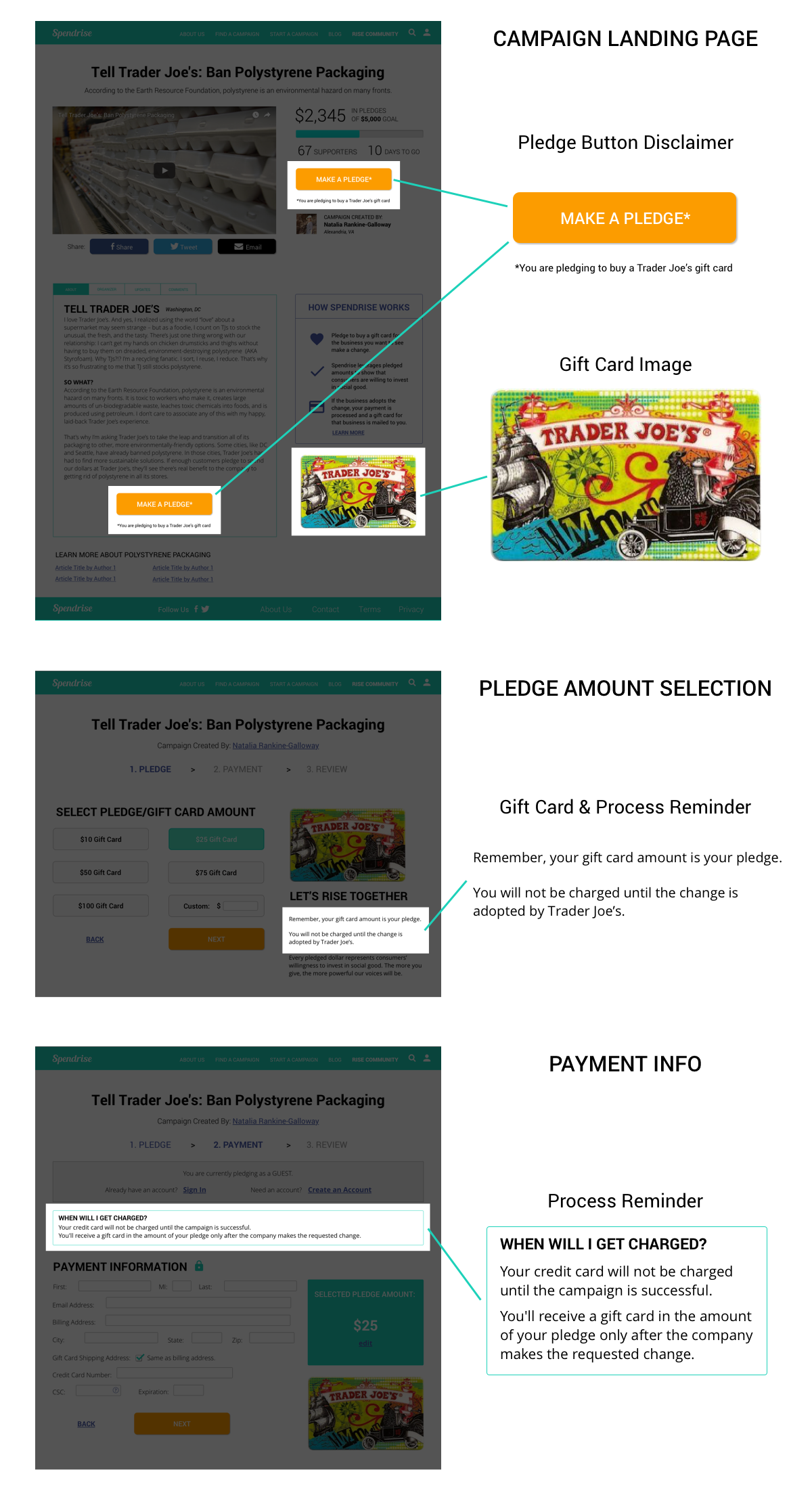
We added explanations and reminders throughout the process to make it clear that users were pledging to buy a gift card.
Conclusion
The biggest lesson I learned during this project was the importance of content in design. Because our low-fidelity prototype did not have real content, users had a difficult time finding what they looking for or providing good feedback. I also learned that placing smaller pieces of information in the appropriate contexts was a more effective strategy for educating users than forcing it all up front.

Mobile Prototype
Ready to make something great together?