
Brief
Peet’s Coffee & Tea wanted to expand its business by creating a website that would allow offices near its locations to place group orders for delivery or pickup.
Duration
2 weeks
The Problem
Existing catering services that offer coffee don’t accommodate individual needs or preferences, and group office orders of food or drinks organized by individuals often lead to mix-ups due to poor communication.
My Solution
Offices can use Peet’s Group Orders to organize group orders of coffee and tea that allow employees to personalize their own drinks.
My Role
Competitive analysis, information architecture, sketching, prototyping, usability testing
Tools
Pen, Marker, Paper, Post-Its, OmniGraffle, Axure RP
Discovery & Research
Competitive Analysis
I analyzed the online ordering options provided by several coffee shops, restaurants, and food delivery services including Starbucks, FetchCoffee, Dunkin Donuts, Caribou Coffee, Panera, Jimmy John’s, Seamless, and Restaurants on the Run. Other than Starbucks, which was only testing small deliveries exclusively inside the Empire State Building, no coffee shop or restaurant provided a service for group ordering of individual drinks. This meant that there was an opportunity for Peet’s to capitalize on this untapped market.
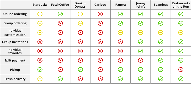
Comparison of options provided by competing services
Functionally, the Jimmy John’s group ordering system was the closest to matching the needs of Peet’s. However, analyzing the site’s user flows, site map, and features revealed an overly complex system that could be greatly simplified for Peet’s.
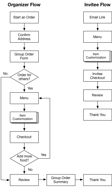
Jimmy John’s complex group ordering user flows
Card Sorting
I used card sorting to organize Peet’s food and drink offerings into understandable categories for their menu. During the first round, I made the mistake of including nearly every option from the menu and also including drinks with special branded names like Javiva. In addition to taking a lot of time to set up, this led to a lot of confusion among participants as to how to best sort items.

The first round of card sorting had too many options, which led to confusion among participants.
In subsequent rounds, I significantly reduced the number of options and provided more general and easy to understand names, which allowed me to more easily determine a consensus for organization.
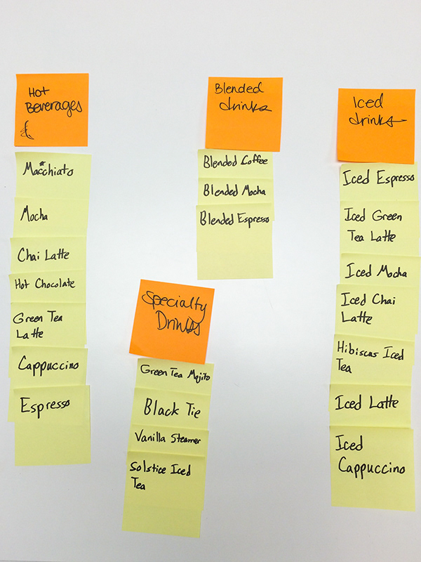
This later round of card sorting with more general names for drinks helped participants understand and organize the options.
User Research
I was provided with three user personas that represented the target user types for whom I was designing. Charlotte was the primary persona and was used to design the group organizer flow. Justin and Ariana were used to design different aspects of the invitee user flow.
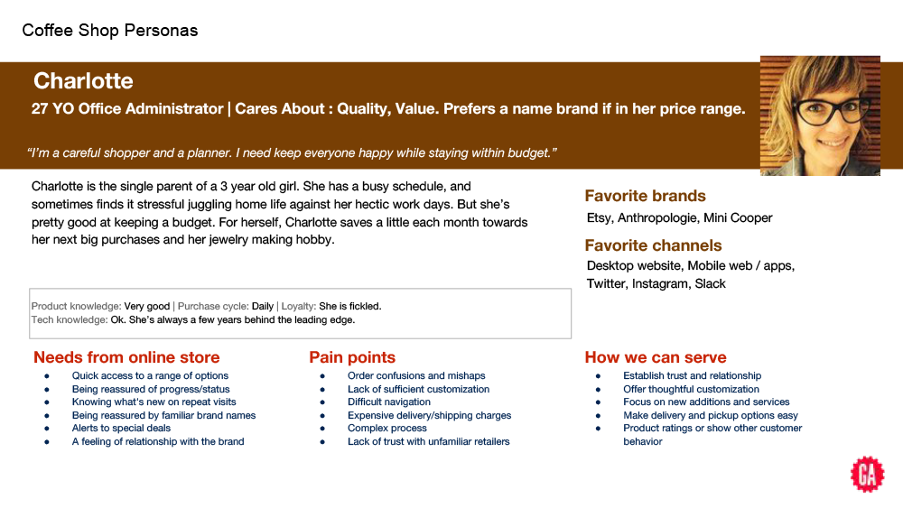
Charlotte was the primary persona and was used to design the group organizer flow
Ideation
Storyboard
I created a storyboard to illustrate how Charlotte and her coworkers would use the Peet’s group ordering site. This allowed me to get a clearer understanding of what users needed from the site.
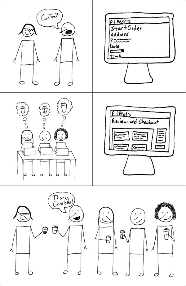
Charlotte organizes a Peet’s group order of coffee and lets her coworkers customize each of their drinks.
Narrowing Scope & Structure
User Flows
I used my story maps to produce two simple user flows in OmniGraffle, one for the group organizer and one for invitees.

Sketches
I created rough thumbnail sketches of a variety of possible layouts for all the pages in the user flows and then iterated on the best of these rough sketches, making larger sketches to work out all the details.
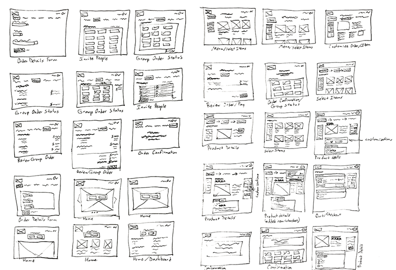
Rough thumbnail sketches

Later iterations of sketches
Sitemaps
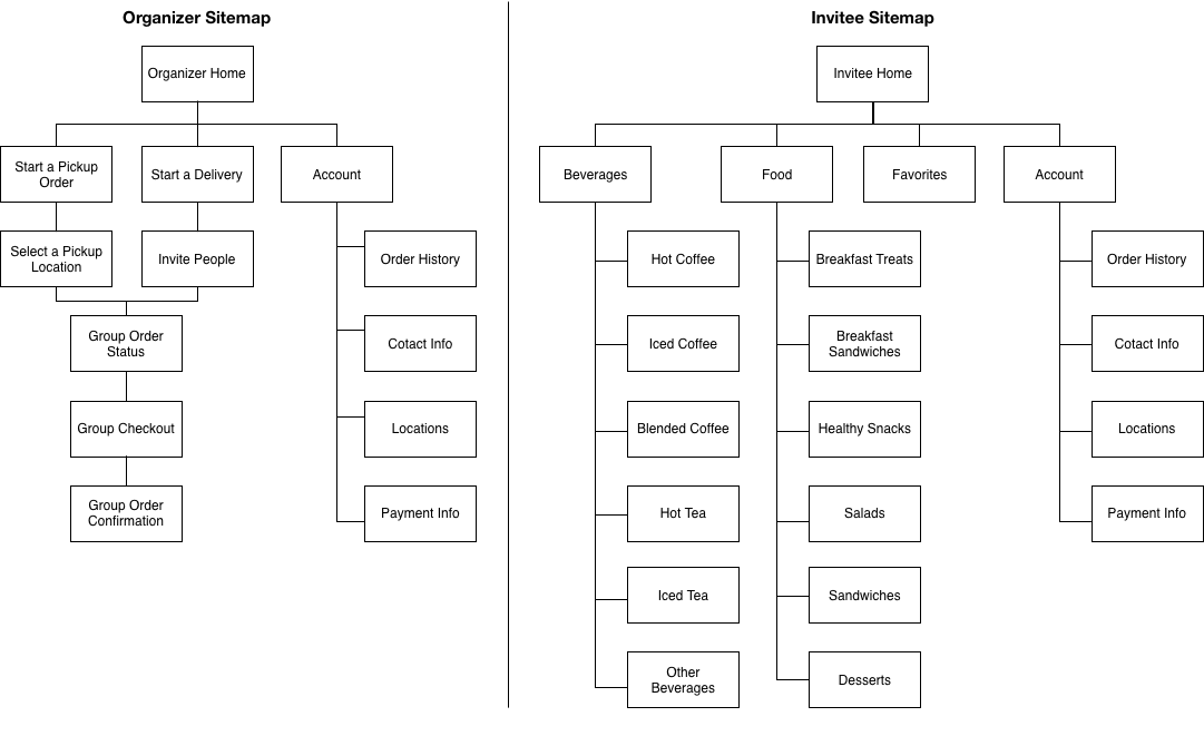
Combining the user flows and the results from card sorting, I created site maps for the group organizer and invitees.
Prototyping and Testing
With the main user flows mapped and sketched out, I created a clickable prototype of the site using Axure RP. I then conducted usability tests on the prototype with several users for both the organizer and invitee roles, which revealed a few key issues that I was able to resolve in later iterations of the prototype.

Usability testing the prototype
Originally, I included featured products on the organizer’s home page. However, this confused a few testers as to the purpose of the page, so I removed the products, which streamlined the flow.
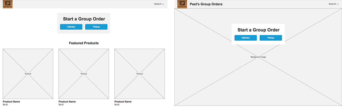
The group organizer home page before and after removing the featured products
Some testers were also confused and frustrated by the group ordering process itself because they could not tell how long it was going to take or where they were in the process. To resolve this, I added numbered steps to the top of each page, which indicated the user’s progress.
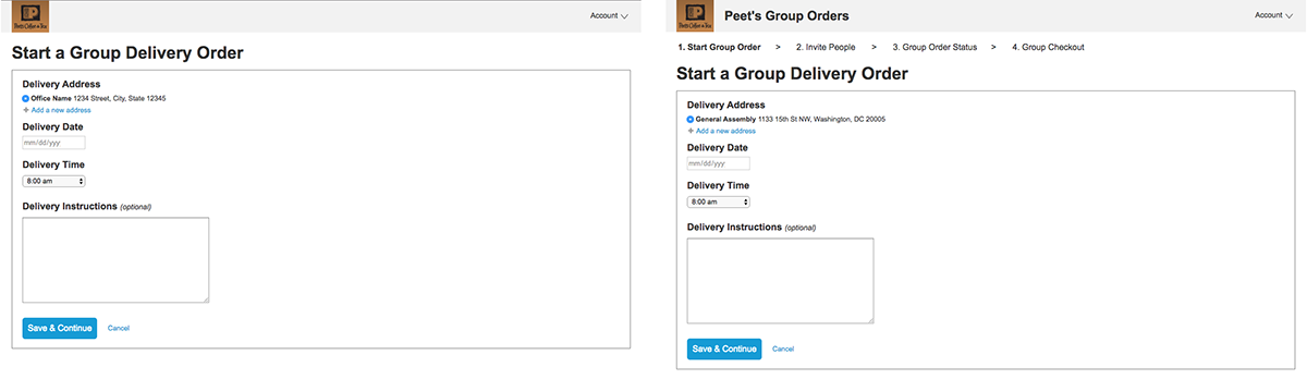
The group order process before and after adding numbered progress steps
The group order status was initially designed to only show the status of invitees placing their individual orders, but testers pointed out that there were several pieces of information that they would need while waiting for the invitees to complete their order. These included contact info for the store preparing the order, the delivery address, the delivery date and time, and the time that orders must be submitted by in order to have the order delivered on time. I added this information in an order details section above the invitee orders.
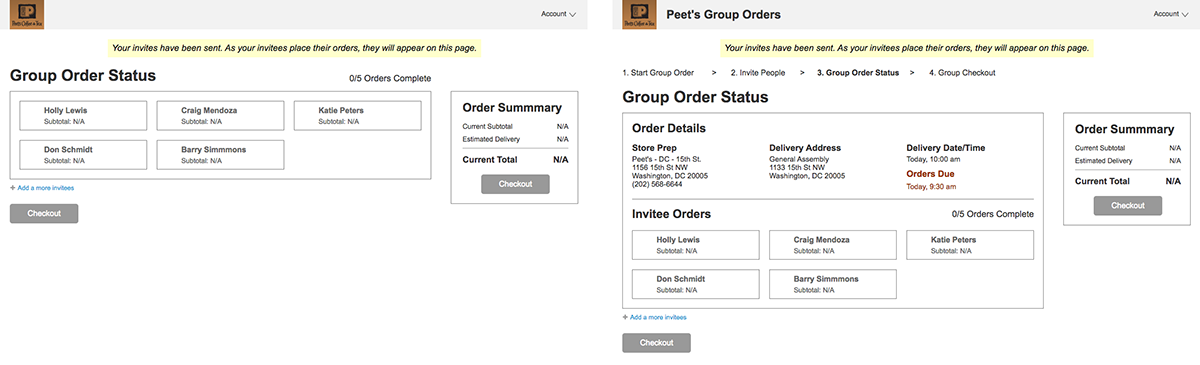
The group order status page before and after adding order details
Conclusion
One of the biggest lessons I learned during this was project was to keep card sorting simple. I gave too many options to participants in my first rounds of card sorting, which wasted time and led to a lot of confusion among participants. When I removed similar items and branded names, I obtained much better results.
Final Interactive Prototype
Click the image to open the prototype in a new tab.

Ready to make something great together?